I think of color as having personality. I get a sense of colors much the way I get a sense of people at a dinner party. There are those who dominate the conversation, others who are quiet, yet have really interesting things to say once encouraged. Some people light up when seated next to someone they enjoy or are able to bond with, others prefer to ask questions and listen, but however they behave, all are interacting with each other in different ways. Color is similar.
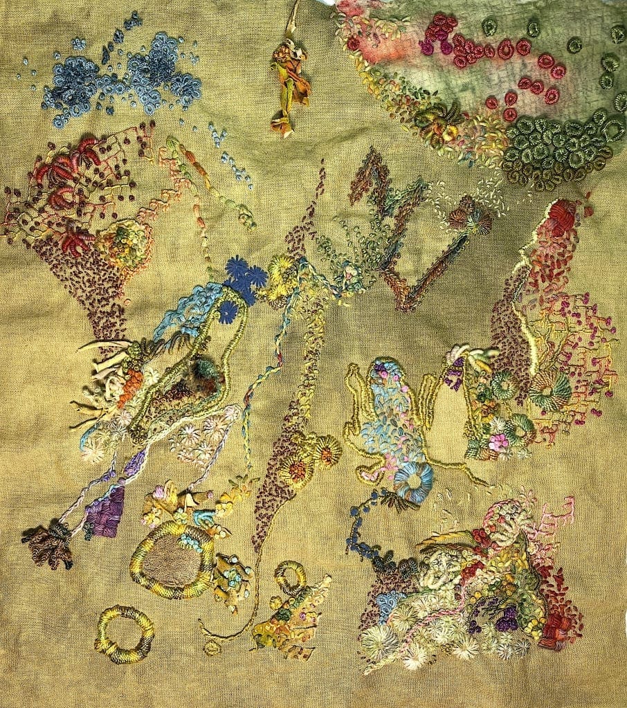
I did a Youtube video, Choosing Thread Colors a few months ago, but as I’m always thinking about color and since color is such a huge component of how I design, I thought I’d talk about it a bit more.
When I was at Parson’s we had semester long classes on the topic of color and color theory and while I’m grateful to know some of the basics such as cool vs warm, tint, shade, tone, etc, I also think it’s important to know what colors speak to you specifically. If someone tells you, green is a soothing color, which for many people it often is, but you happen to hate green, incorporating a great deal of green in your piece may cause you to not love the finished product.
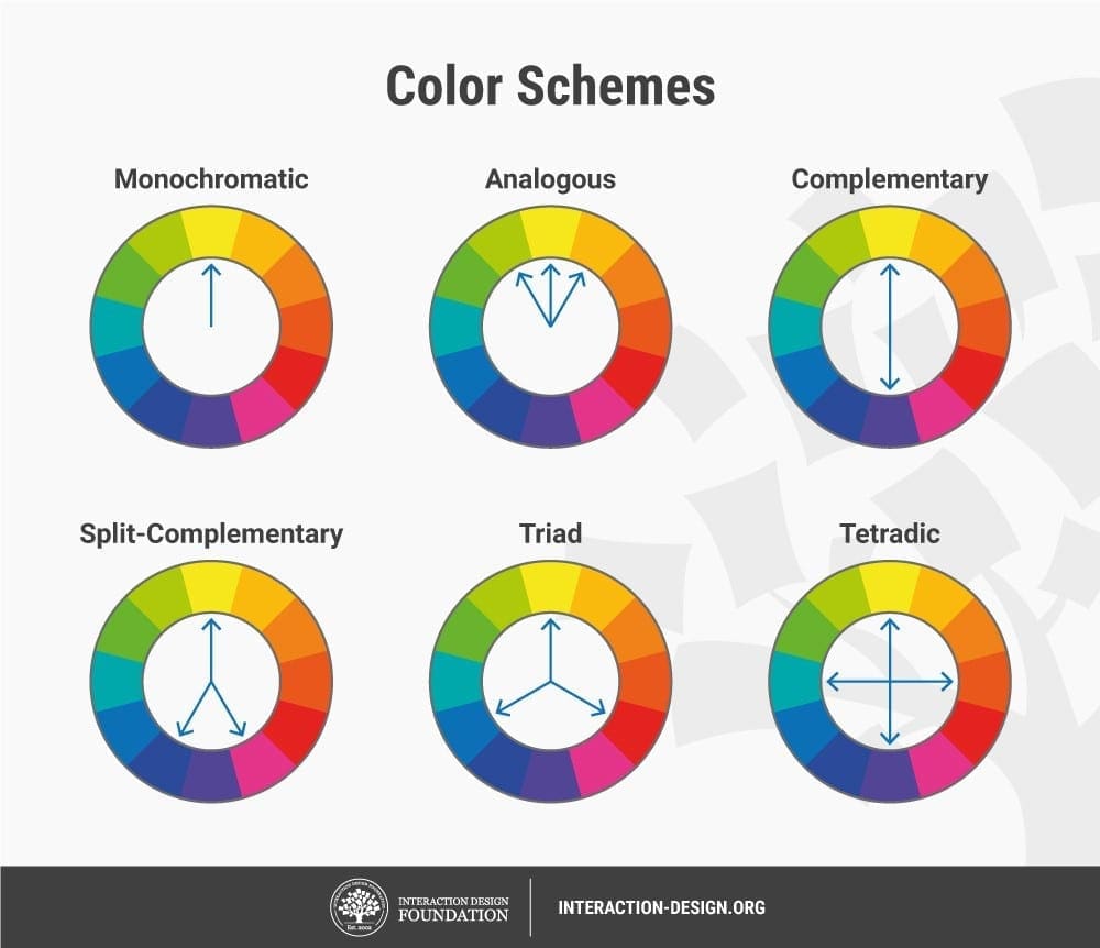
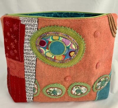
I’m all about diversity. I want my eye to travel from one place to another. I want to see different things the longer I look. I like pattern, but I don’t want to focus only on pattern. I want to see things beyond pattern. I love curved shapes, but appreciate angular shapes as well. It’s the same with color. I try to listen to the colors I’m choosing and then make decisions on what I’m hearing. What I mean by that is if I’m working on a piece that has a really bossy color such as bright red (think of it as yelling at you, “Look at ME!”) then I’m going to think about what colors I can use around it. Now maybe I want that red to do all the talking and everyone else will be listening. Then I might use a lot of neutrals, maybe a bit of black somewhere, I might add something else, but I’m not going to add another bossy color to drown the red out. I want the red to stand out. On the other hand, if I don’t want the red diva to dominate, then that’s going to change what other colors I choose. But the point is I’m listening. I’m looking. I’m observing and then I’m making my decisions based on what I’m hearing.
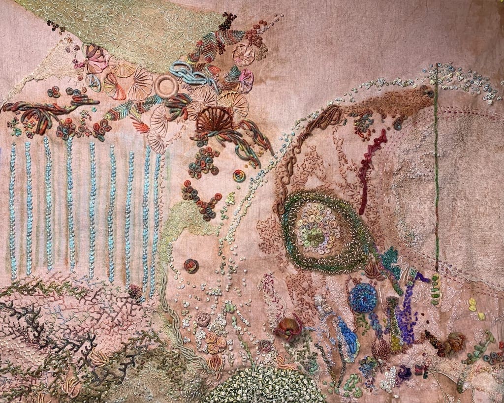
I love warm colors: Red, Orange, Yellow, but also love cool colors: Blue, Green, Purple. And once you start combining them you can come up with a wonderfully, fascinating mix of personalities and conversations!
I love the soft aqua Palestrina knots you did in rows over the lines you painted. This piece has a bit of a beachy feel to it despite the flesh tone of the linen, it reminds me of wet sand with tidal pools.
Thank you Sandi. I thought those palestrina knots would take over the piece, but they haven’t and I’m pleased with how they look. Now a few more tweaks here and there and I think I will have finished! ❤️
I never thought that color has a personality, and now that you’ve pointed it out, it makes sense!
Sent from my iPad
>
I’m glad you think so, because as I was writing this, I wondered if anyone would understand or know what I was talking about! ❤️
i don’t think my comment showed up. I love the analogy. It does make sense. both pieces are beautiful. Color is probably the biggest decision for me. Good post. I’ll watch the thread colors video tonight.
I’m glad it makes sense. Everyone responds to color differently so color theory, while certainly important, only goes so far. ❤️
I appreciate another lesson on color. Using them to compliment each other is a much calmer way of thinking about it than if they fight each other.
I like your dinner party analogy.
Haha! Thanks so much. ❤️
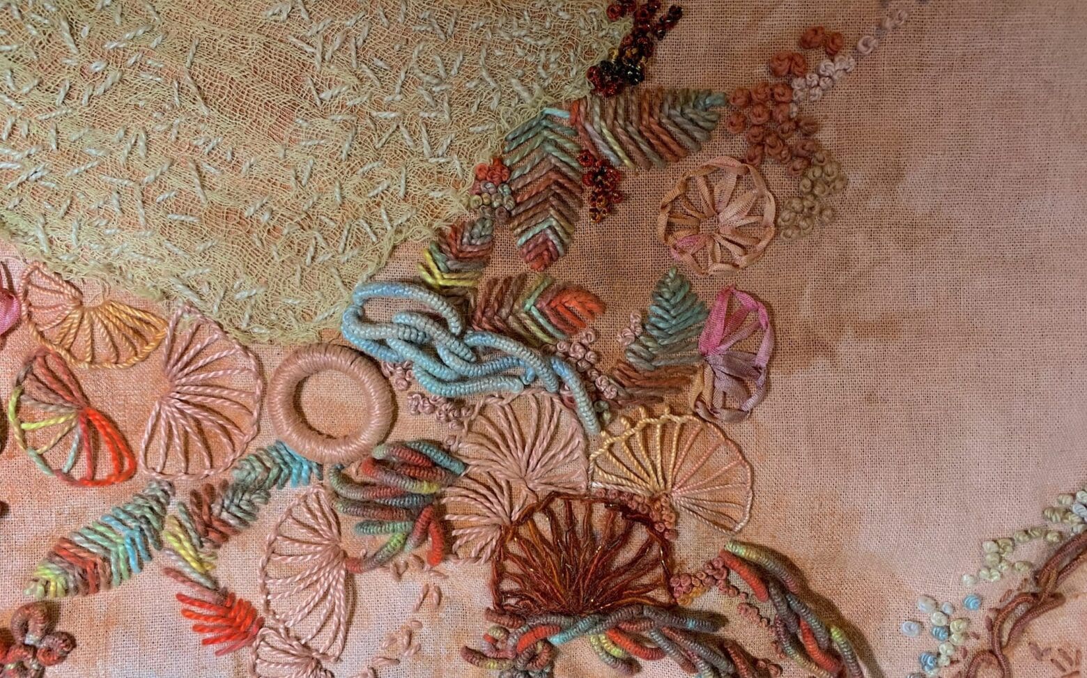
Having watched you grow this piece, I am struck by how it has come together so cohesively yet is comprised of very diverse subtexts. For example, the straight lines of the painted stripes are a wonderful foil for the large enclosure of bullion circles. Likewise, the meandering feather stitch is perfectly balanced by the stitched cheesecloth. My eye just seems to seek out these counterparts naturally. I personally love your background color though I know it gave you fits, lol.
Thank you so much Arlene. So nice to hear! And such a perfect example of how color is seen by each of us differently! I think I may eventually fall in love with this piece, if for no other reason than it’s been so challenging. ❤️